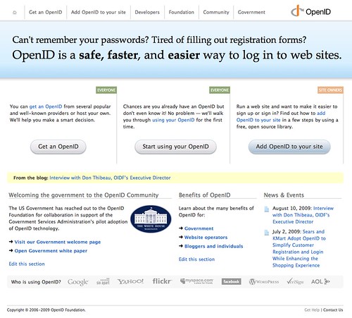
 As the US government considers OpenID as a vehicle for citizen engagement, it became time for the OpenID Foundation's website to receive similar consideration. For some time, the site has been neglected and ignored — serving primarily as a resource for developers, with little regard paid to people just learning about digital identity. The new design — while far from complete or final — is a first step to remedy that imbalance.
Moreover, I think it's also important to realize that in Don's post today (and related interview), we're starting to witness the slow realization of the importance and relevance of digital identity to a broader audience — one that has become accustomed to having fractured identities across the web, and having to create new logins on every website with which they wish to engage.
The new design is intended to be more open and clean — and to present a fresher face for OpenID — indeed, to provide the foundation for a re-invigorated identity.
As I mentioned, the site is far from complete — and will need a lot of work to become the public resource that it needs to be in order to continue to make OpenID — both concept and technology — more accessible to an increasingly wider swath of the internet population.
If you have feedback or ideas, please don't hesitate to post them or send them to the marketing mailing list.
Credit where credit's due: This project came together in a very short amount of time, and I'd like to give a shoutout to the team at Cloud Four (Jason, Lyza, Megan, John and Aileen), Amanda Richardson, John Ehrig from Global Inventures, Michael Olson and Brian Kissel from Janrain and Don Thibeau — who contributed to help make this happen. Of course the work's just begun, but this is an important first step forward for the Foundation.
© Copyright | OpenID Foundation | All Rights Reserved l Read our Privacy Policy
Adjust Cookie Setting
To provide the best experiences, we use technologies like cookies to store and/or access device information. Consenting to these technologies will allow us to process data such as browsing behavior or unique IDs on this site. Not consenting or withdrawing consent, may adversely affect certain features and functions.